Sunday, 29 March 2015

Rationale

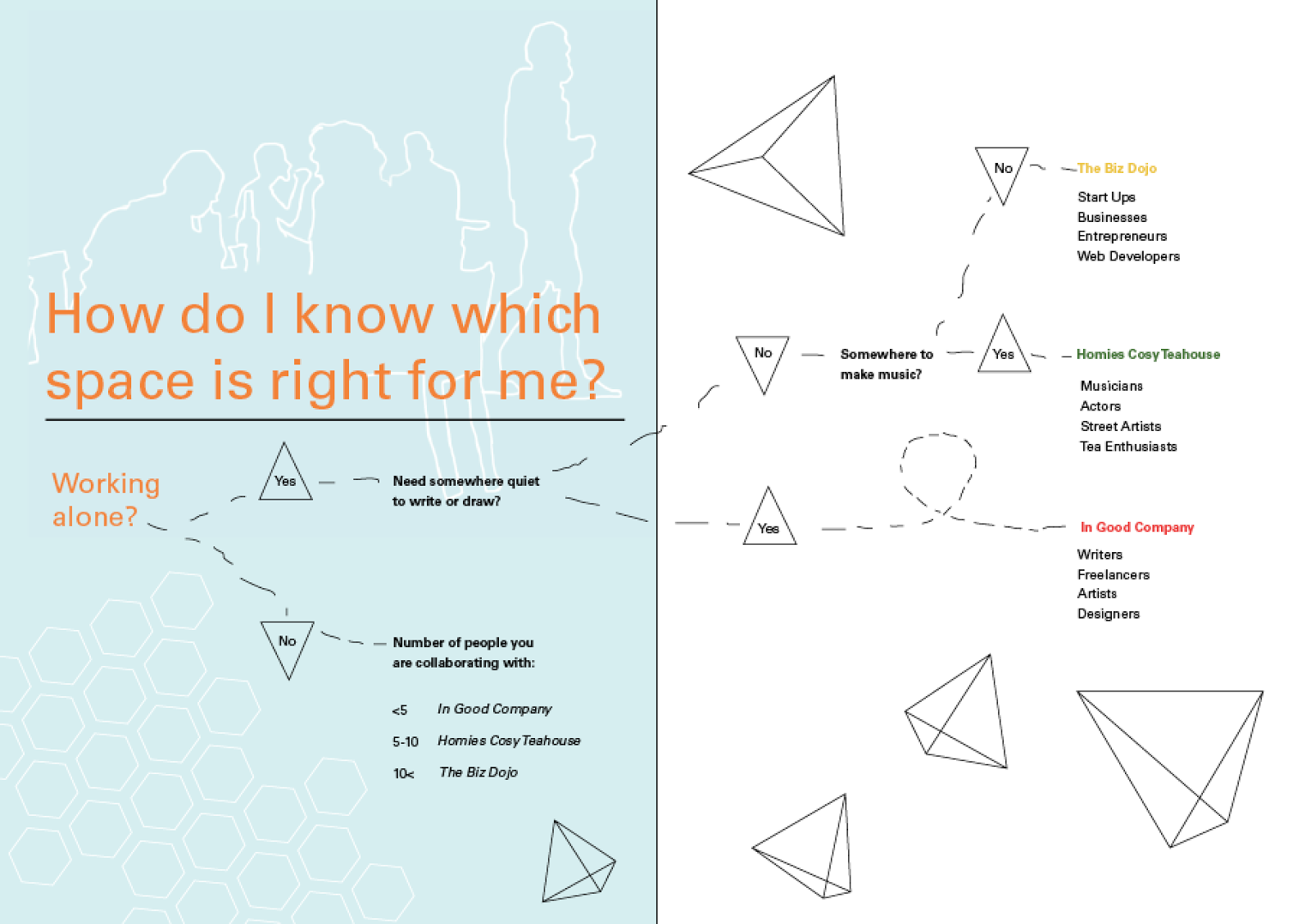
I wanted to convey a group of inviting, inspiring spaces that people can utilise for their creative endeavors. To do this I used a range of vibrant colours and the application of collage to show the coming together of different elements – like the coming together of different creative types.

The patterns used show creativity; through smooth swirling lines (Homies spread) and ideation, through a zigzag of different points (In Good Company spread).  The idea of collaboration is linked in the honeycomb pattern used in The Biz Dojo spread.

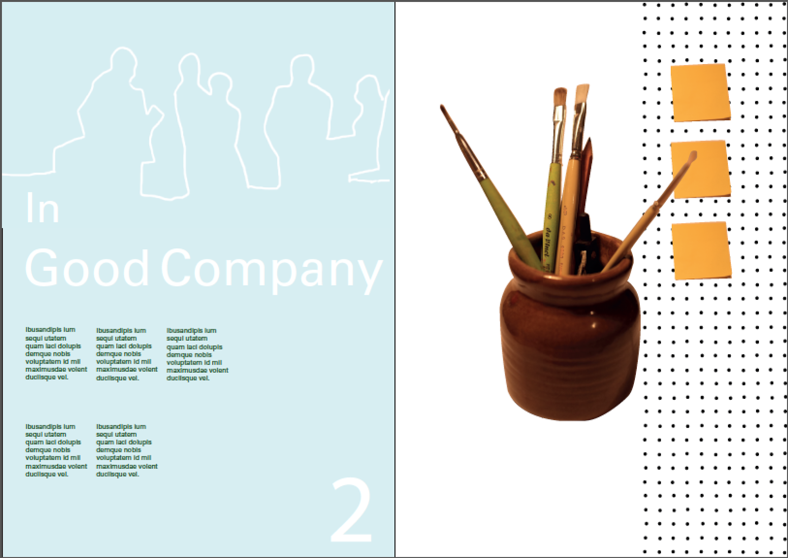
The application of the grid helps to determine a hierarchy within the spreads. The titles are always in the same place and are large and dominant. The gird makes the information more accessible and improves readability.

I learnt how to interpret a space, synthesise information and design a relevant brochure. I also learnt how to apply a grid and I improved my InDesign skills. This will inform my future projects because I now have a relevant design system to apply and I have added to my design thinking skills.

word count: 177

Week 6

Session 1:


Monday, 30th March
  • Final Critique
    Revisit the assessment criteria and brief requirements.
    Proof read and check all detailing.
    Include your name and 2015 on the back cover of the booklet
  • Consider output and binding options.
  • Rationale – approx 150 words
    Briefly outline:
    What was your topic;
    What were the relevant rational and emotive qualities / attitude / atmosphere you wanted to convey;
    How does the visual language, application of grid and typographic approach achieve this;
    What did you learn about your own process (positive and/or negative) and how will this inform your approach to future projects. 
Preparation for next studio
  • Output final brochure.
    Export as a Pdf and save to a memory stick.
    Take to bureau with a final proof.
  • Finalise Online blog
Session 2:

Tuesday, 31st March
  • Final presentation and physical hand-in 11am – 12 noon. Tutors will be in studio from 9am.
  • Physical Hand-in an A3 manilla or white envelope, clearly labeled with your name, student id and stream (A, B, C, or D)
    12pg A5 booklet
    Workbook
    Rationale
  • Blog
    Email your blog url to your lecturer before midnight on Tuesday 31 March.
  • Upload a pdf of the finished 12 page booklet to the dropbox below > before Midnight on Tuesday 31 March.
  • And Upload the InDesign file into the 2nd dropbox below > before Midnight on Tuesday 31 March.
    You will need to package the the indesign document (under file in Indesign).
    This collects all the links and fonts used into a folder.
    And then compress (under file in Indesign) (this is called zip).
    This makes the folder small enough to upload.

Wednesday, 25 March 2015

Final Developments

Advancing my project by editing rags and leading, aligning text to grid and working on extra spread.


Tuesday, 24 March 2015

Development

I left my cover page till last, this was helpful as I was able to draw on my spreads for ideas for my cover page.


Advancing my project by continuing to add to my 3 main spreads. Trying to make them "more fun".


Monday, 23 March 2015

Week 5 Second Lesson

Tuesday, 24th March
  • Share your findings regarding digi output bureau options.
  • Investigate how to set up documents for outputting.
    (Instructions can be found on stream. There is also an Indesign document to play around with).
  • Critique focusing on micro level – check consistency between spreads, para styles, kerning, alignments, rags and widows.
Preparation for next studio
  • Refine
  • Produce a completed mock-up of guide full size to be presented at the following class.

Sunday, 22 March 2015

Week 5

Session 1:
Studio
Formal Critique

Revisit the assessment criteria.
Evaluate as a viewer.
What is working, what is problematic and what are possible solutions to address these issues.
Workshop cover
Workshop Map

Do a quick memory map of your journey to Massey from home using no words. Can other students follow the map? What visual cues were used? How much information was necessary? What information was redundant? Did it accurately indicate different distances? 
Remember – the map needs to reflect the over-arching stylistic approach.

Critique:

Remove second rule from under title
Write addresses in bold
Redo cover pages - they don't currently reflect overall stylistic approach
- Add more character
Homies needs more green - new imagery?
Spread imagery across both pages like IGC spread


Preparation for next studio
Research digi output bureau options and relevant:

set-up requirements;
turn around time;
price;
available paper stock.
Get colour tests done.

Printed for Class:

I started working on m cover pages and my extra spread:


The idea for my extra spread is a flow chart to determine which space is right for you, depending on what you want to achieve in the space.


Tuesday, 17 March 2015

Up To Date

Advancing my project by adding text to my brochure.


Map

I started working on my map - using a complimentary orange that I thought worked well with the subtle light blue I had been using.
Each space has it won coloured dot on its corresponding location.

I added in the main street names and some important landmarks - directions to the beehive and a little icon for Te Papa.


I then made a key to show which dot corresponds to each space.


Symbols


Monday, 16 March 2015

incorporating new patterns

I was told in the critique that the ideas behind my patterns weren't clearly conveyed.
I advanced my brochure by redesigning the patterns.


Sunday, 15 March 2015

Critique ect.


Session 2:

Critique type application.

Use the points raised in the type presentation and handouts as criteria for your critique.

Focus on issues such as point size, line length, hierarchy, visual flow, negative space.

Workshop use of extra page.

Consider the needs of the audience. 

Mock up complete booklet full size.

Turn on visible guides when printing out the booklet so the underlying grid structure is obvious.

Consider the over-all structure of the guide = sequencing of information, differentiation between sections, differentiation between destinations/activity spreads.

How can the grid be manipulated from spread to spread to generate pacing?

These show the spreads as I began to incorporate ideas from the critique:


Preparation for next studio
  • Produce a refined full mock-up of guide full size to be presented at the following class.
    It doesn’t matter if all of the spreads aren’t complete - just make sure that you indicate your intent (Lorem Ipsum).
  • Complete written content of brochure

Week 4 Class

Session 1:

Lectorial – Type

Justify your choice of stylistic approach in terms of communication intent and how it relates to the subject matter and audience.

Do they reflect the emotive quality or essence of subject matter?
 

How can you develop your ideas (rather than rejecting what you've done and beginning again from scratch)?

Hierarchy and layout exercise

On your strongest double page spread,establish and prioritise the number and levels of info – head, subhead, pull-out quote, secondary info.

Create a range of compositions exploring layout, hierarchy and visual flow

Critique initial mock-ups of double page spreads, focusing on stylistic approach and composition.
    Critique:

    Change title colour- white fades into background too much

    Edit photos so they don't look yellow - crumpled paper looks like chicken nuggets

    Make new patterns - current patterns are unoriginal

    Simplify text

    The page numbers aren't necessary

    Make it more fun - this is about a fun collaborative space 

    Use of collage/ development of current collage is a good idea for this

    Architecture?

    Kern title - Try condensed and check leading 

    Add in body copy and symbols

    Go back to FADPs when doing collages

    Preparation for next studio
    • Mock-up a range of spreads focusing on well crafted type.
      (Apply the strongest approach to the 3 destination spreads.)


    Working on the Brochure

    I added in elements of collage and patterns for each spread.